Case study: Charge My Street

The background
At Progress Web, we love working with organizations that are committed to making a real difference, especially when it comes to sustainability and the environment. When Charge My Street approached us, we were excited by their mission to make electric vehicle charging accessible across England.
Their focus on community involvement and their dedication to promoting greener transportation really resonated with us. By installing and operating public charge points funded through community shares, they’re helping to build the infrastructure needed for a more sustainable future. This project was a great fit for us, and we were ready to improve their website to better support their important goals.
Challenges Encountered
Charge My Street's existing website, while functional, presented several usability issues that hindered user experience and satisfaction. Key challenges identified through a deep heuristic evaluation and user testing included:
Complex Navigation: Users found it difficult to navigate the site, particularly when attempting to submit forms, explore investment opportunities, or locate specific information on charging processes.
Unclear Information Structure: Important information was often buried within the text, making it hard for users to quickly find what they needed.
Inconsistent Design: There were inconsistencies in the design and user interface across different pages, leading to confusion and a disjointed experience.
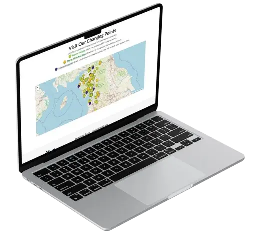
Hidden Map Features: The map features, crucial for locating charge points, were not immediately obvious to users.
Miscommunication of Charging Process: Many users were unaware that the actual charging process was managed through an external application, leading to further confusion.
Solutions Applied
A detailed heuristic evaluation was conducted using Jakob Nielsen's "10 Usability Heuristics for User Interface Design," alongside additional criteria for diversity. This evaluation highlighted areas needing improvement, such as error prevention, visibility of system status, and aesthetic design.
Twelve volunteers participated in user testing, providing valuable feedback on the website's functionality and design. The testing was a combination of mobile devices and desktops, as well as in-person and online meetings. Their insights were crucial in identifying pain points, particularly in navigation and task completion.
Based on the findings, a new user interface was developed. This redesign focused on:
- Simplified Navigation
- Improved Information Structure
- Consistent Design
- Enhanced Map Features
- Clear Communication of Charging Process
Results and impact
The new user interface for Charge My Street received highly positive feedback from both the internal team and users. The redesign successfully addressed the usability issues identified during the heuristic evaluation and user testing. The streamlined navigation and clearer information structure significantly improved user satisfaction, leading to shorter task completion times and positive feedback on the website's usability. Additionally, the website's new design made it more accessible to a wider range of users, aligning with Charge My Street's mission to make EV charging more inclusive. The modern, minimalist design not only enhanced usability but also improved the overall brand perception, aligning the website’s look and feel with Charge My Street’s commitment to sustainability and innovation. This case study highlights the importance of a user-centric approach in web design, demonstrating how thoughtful evaluation and redesign can lead to tangible improvements in user experience and business outcomes.
Let's connect.
Ready to transform your online presence? Let us show you how we can create a tool that delivers increased organic traffic and transforms visits into sales.